case study
Overview and Goals
Yoga Studio App provides yoga classes and meditation practices at home with a goal to make yoga and wellness accessible to everyone, no matter your fitness level.
The goals of Yoga Studio's rebrand and app redesign were to:
✓ Build brand awareness
✓ Increase subscribers
✓ Increase usability of main app features
Goal - Brand Awareness
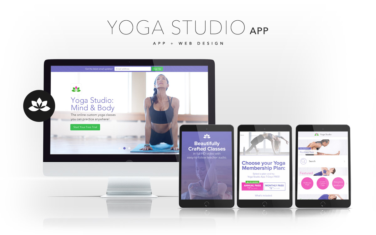
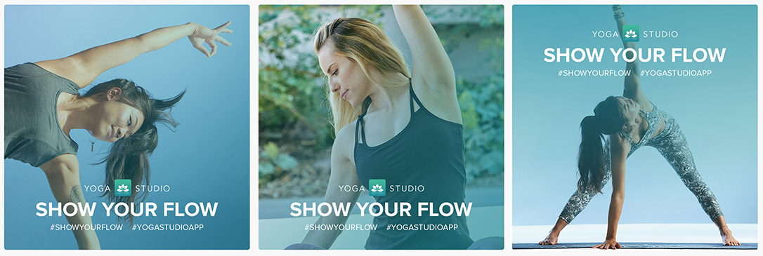
I spearheaded a brand redesign for the company to breathe new life into how the app was presented to customers. My solution was to art direct a photoshoot that showed yogis using the app on phones and iPads, to build a library of photo and video assets to use in upcoming campaigns. The result was hundreds of new assets we could use that showed potential customers the product in the hands of actual yoga practictioners inside their homes, real case uses.
Results - The customers could really imagine how the product could benefit themselves as an at-home yoga and meditation class and the brand now told a true story. Every asset included a yoga or meditation practioner and the app, the library was now full of storytelling pieces that highlighted the product and told a true brand story.

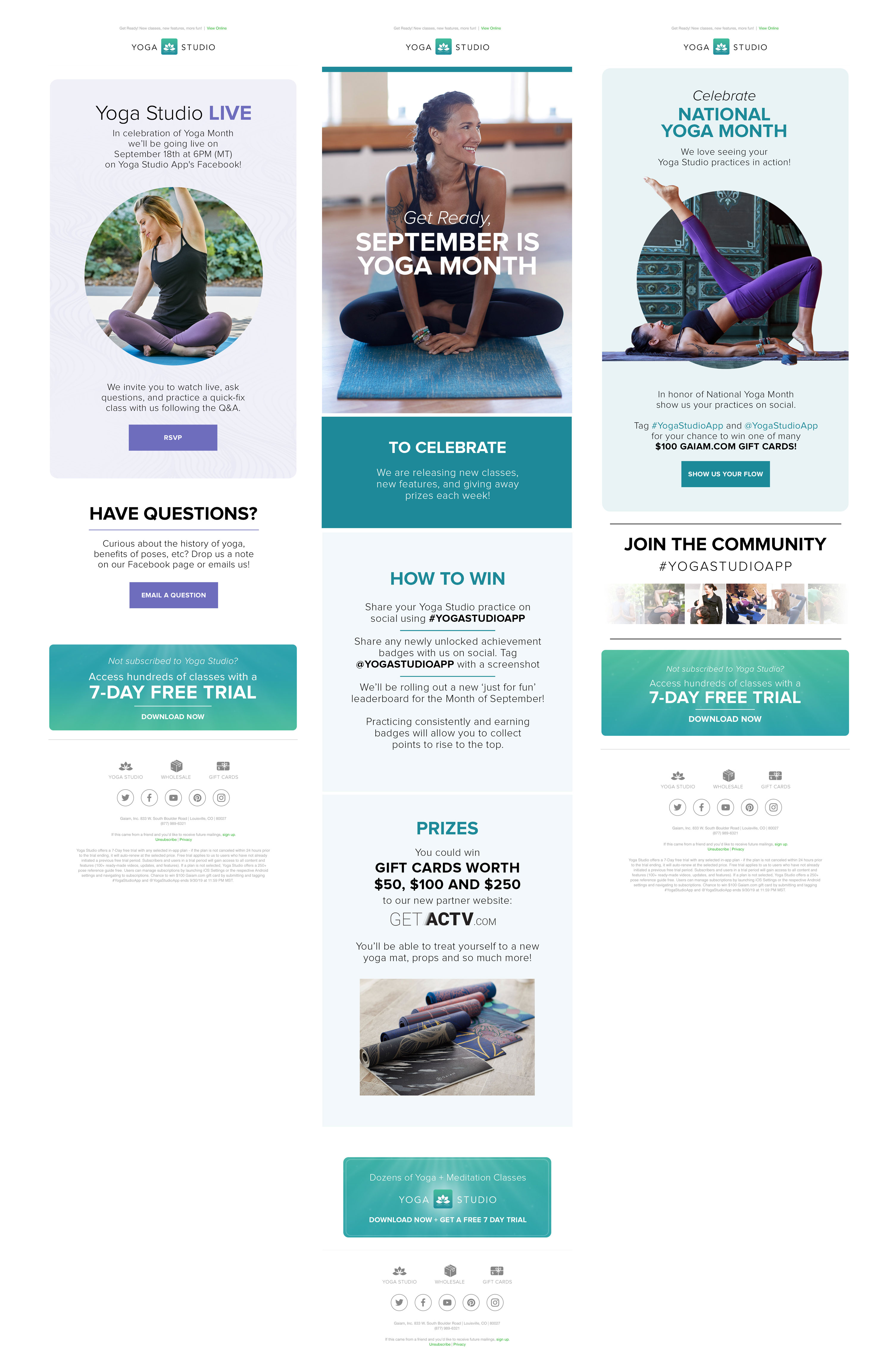
I also brought the new, beautiful photography and bold colors to a welcome series that introduced customers to the app in a bold, visual way. This included introducing the features of the app and how the hundreds of classes are made for anyone to begin their yoga journey.
Results - We tracked the data and this revealed the new photography and style increased user interactions on app trials and social media by 20%.
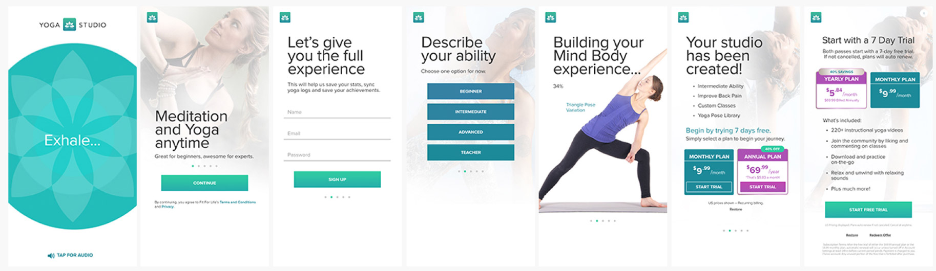
Goal - Increase Subscribers
I solved this goal in two ways. First, I used the color pallete in a new way, I showcased the brighter colors of the Yoga Studio brand to entice new subscribers with fresh energy. I swapped their muted, white design with the bold teal and purple from their palette to capture the attention of new subscribers through the Apple Storefront and email campaigns.
Results - This led to 20% more subscribers in the first 6 months!
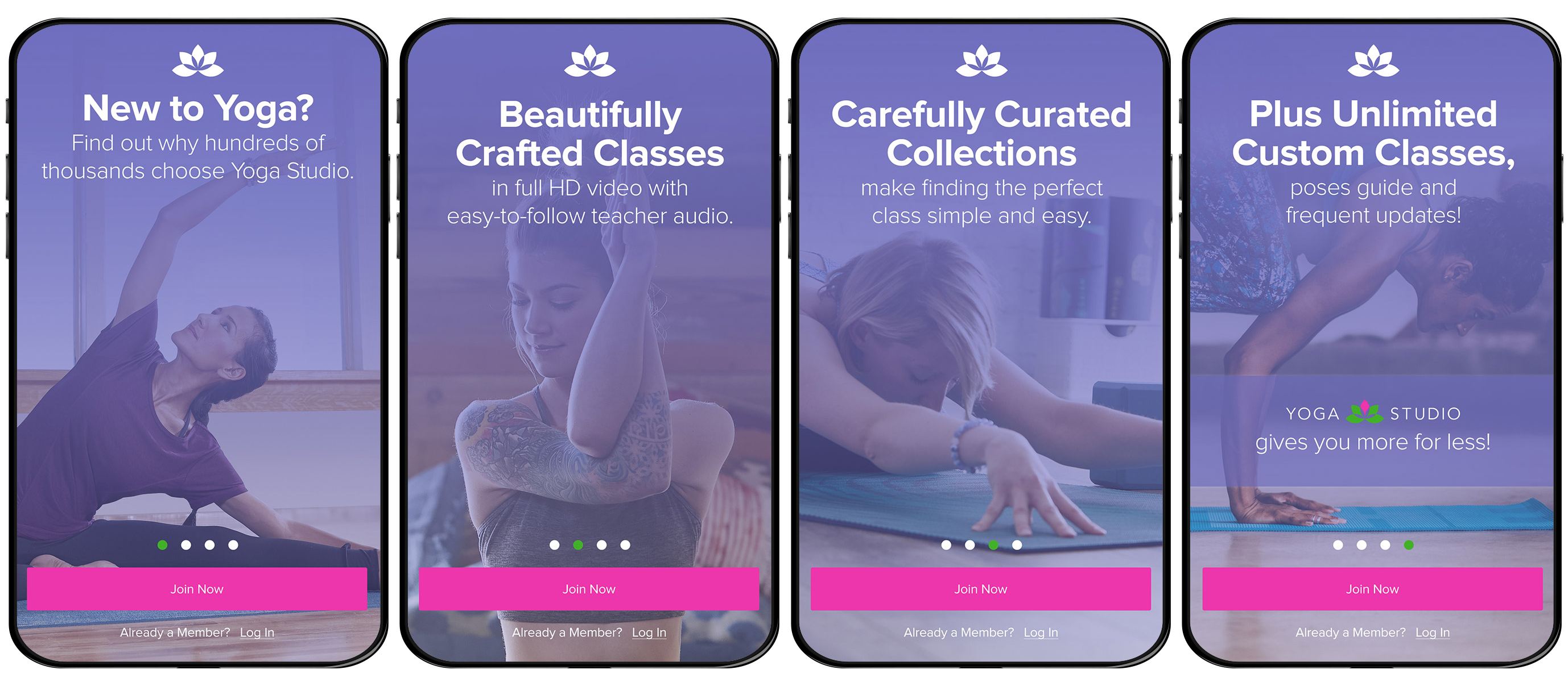
Second, I designed an onboarding series that learned about the customer's needs and unqiue path and then cater to their experience. This included asking the customer about their fitness level and goals then showed curated classes that matched their interests. The final step in the onboarding series was to offer a trial before subscribing.
Results - We tracked the data and this revealed that 15% of trial users ended up purchasing a plan.
Goal - Increase Usability of Features
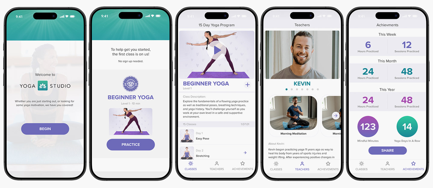
I introduced a gamification feature that congratulated users for completing tasks within the app. They received branded badges and a fun message which encouraged users to continue onto the next level of yoga workouts. The badges were able to be shared socially in order to increase brand awareness.
Results - We had an uptick in the longevity of users.

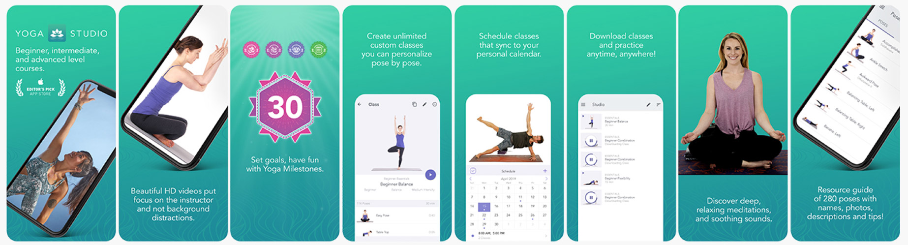
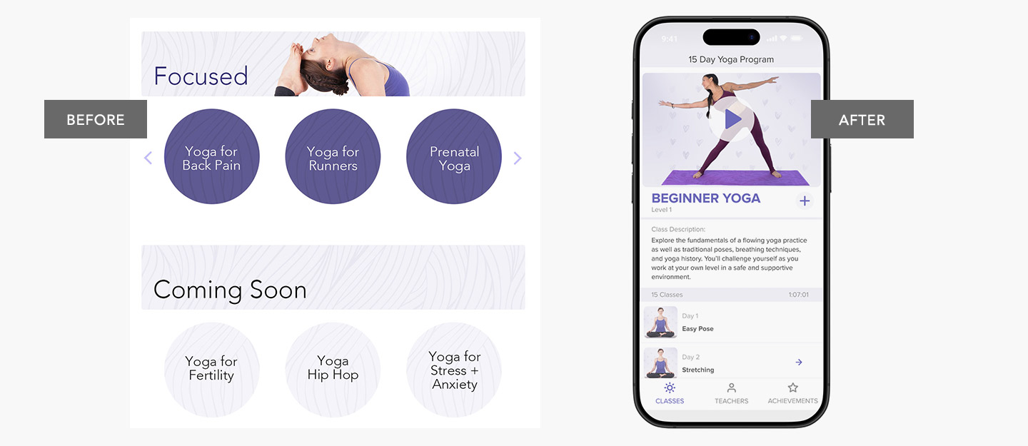
I redesigned the interface to offer the user an intuitve way to access all the favorite fetures in the app.
1. Full Screen videos for each program vs small header graphics offered a clear way to determine which level of class you'd like to access. Photo thumbnails vs text graphics were introduced to showcase each class. This improved usability for the users to determin which classes they wanted to take as they could see poses contained in the class.
2. Bold new colors invited the user to flow through the app more intuitively with giving focus to call to acitons and titles.
3. An Achievements Board was created to encourage the user to keep their yoga practice going, they could now see their track record of hours practiced on a monthly and yearly timeline.
4. Teacher profiles were created to give personality to the app experience and mirror what you experience in an in-studio class. Getting to know each teacher resulted in an increase of user interaction and longevity and created credibility in the collection of qualified instructors. Classes could now also be sorted by instructor, just in a physical studio, users could choose their class based on their favorite teacher.
5. Lastly, I designed a way users could create their own custom series of classes by building a playlist. They could also add each class to a calender to stay on track with class scheduling.
Results - The usability of features increased with the redesign, users loved to share their acheivments on social platforms, and teachers had a space to showcase their unique personality and users responded positively with more subscriptions.
prototype link
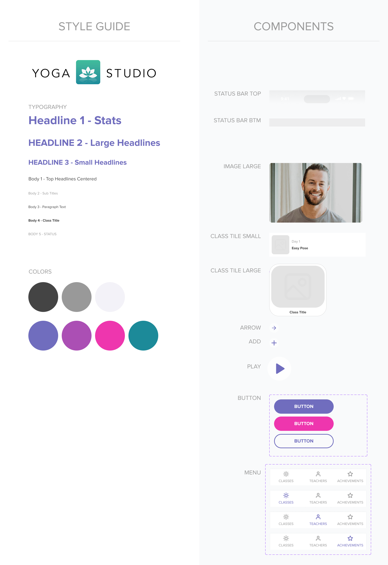
Figma Components
visual design - brand identity
logo design
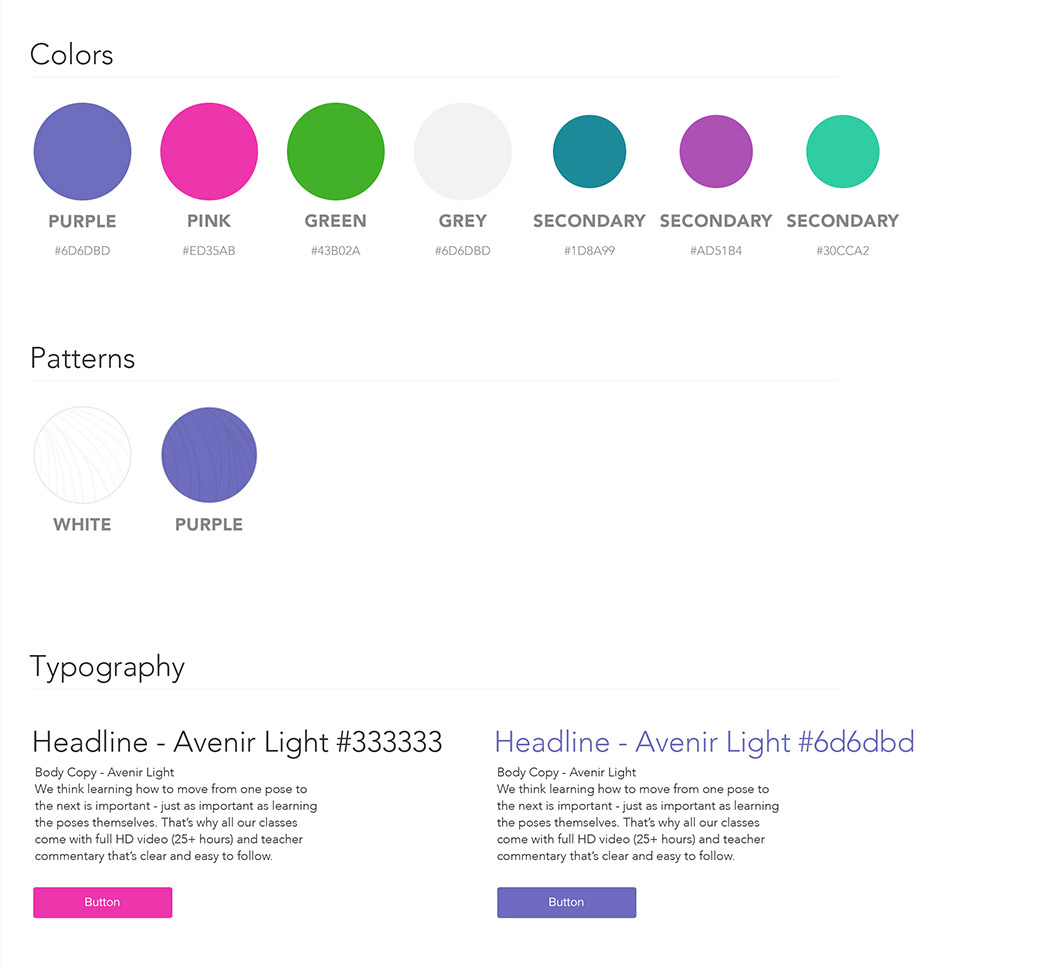
style guide
print design

flyer
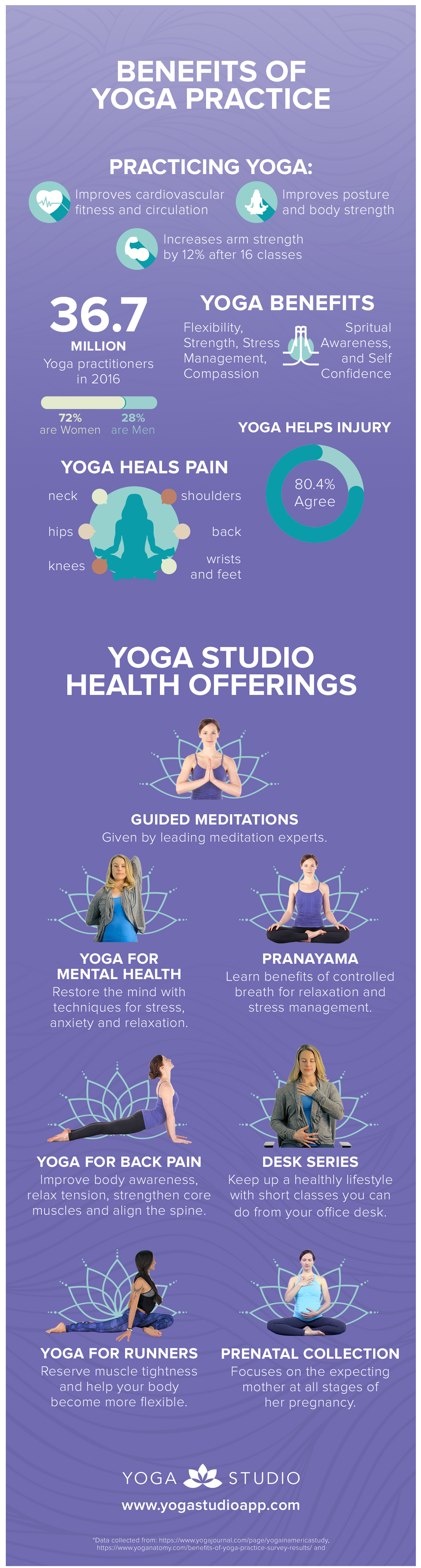
infographic
web design
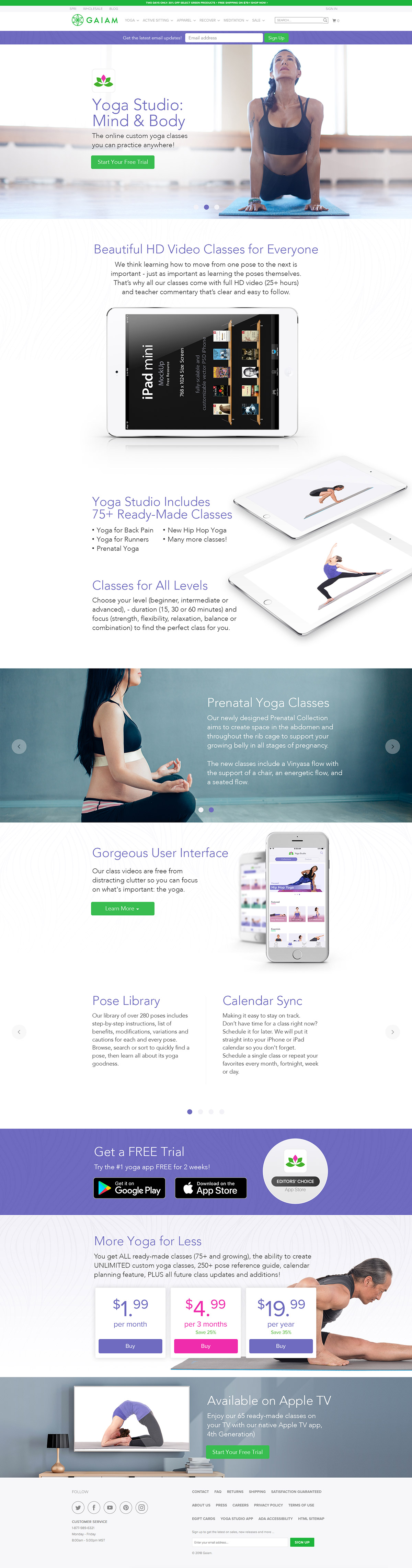
website
banner ad design


email design