
case study
Overview and Goals
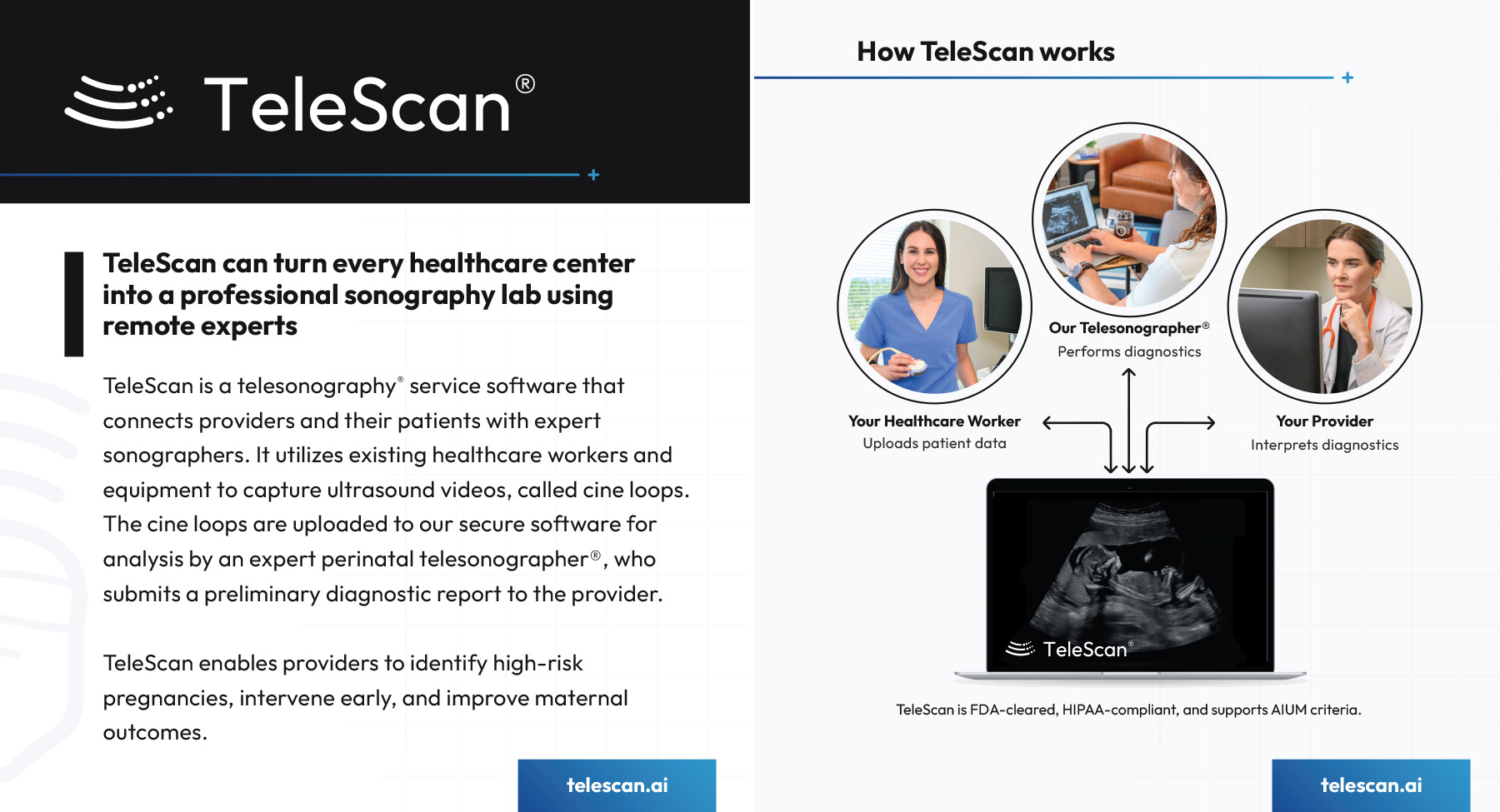
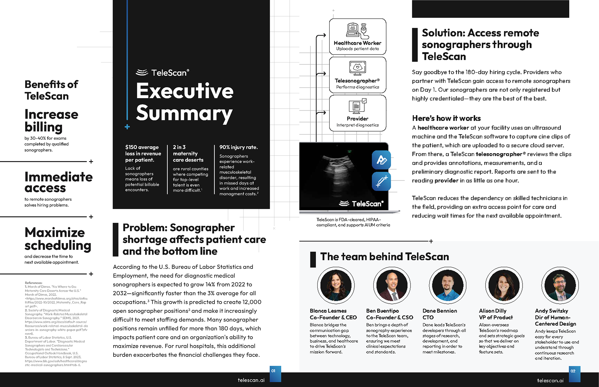
TeleScan® is a cloud-based software-as-a-service solution that connects healthcare providers with remote ultrasound sonographers. These ultrasound experts provide high-quality diagnostics that enable identifing high-risk pregnancies, intervene early, and improve patient outcomes. Many clinics are understaffed and their ultrasound sonographers are overworked.
The overall goals of TeleScan's redesigned interface were to offer a solution for clinics to serve more patients per day and deliver high-quality sonography services, without over-stressing their sonographers. In detail, the goals were to:
✓ Decrease patient examination time
✓ Increase communication between parties
✓ Increase report turnaround speed
✓ Increase usability of main app features
✓ Build brand awareness
Goal - Decrease Exam Time
My role was to update TeleScan's interface to ultimately reduce the time it takes for remote telesonographers to find anatomy as well as communicate with in-clinic healthcare workers who are conducting the ultrasound scans. I accomplished this in a seven ways below:
1. Interface Update - I redesigned the clunky menu system and updated the look to make it more user-friendly. I researched tool bars, designed new, intuitive icons, and reduced the amount of 'clutter' on the interface to bring the focus to the ultrasound video.
Results - The intuitive tools and menubar increased visibility to the ultrasound video and decreased patient exam time.
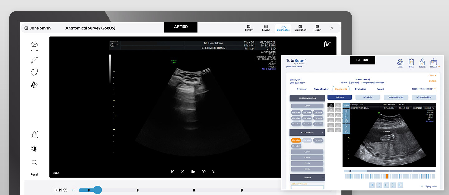
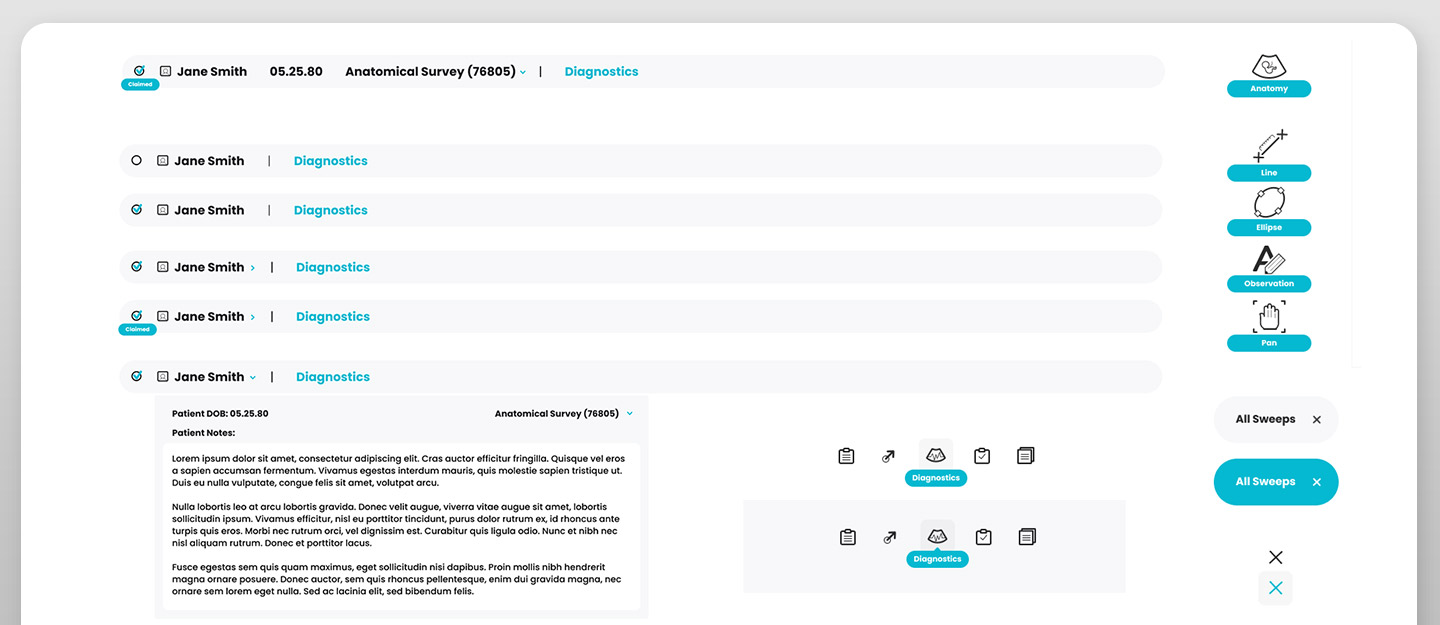
2. Navigation and Menu Systems - I rebuilt the navigation to offer a seamless way to move from Survey, Reviews, Diagnostics, Evaluations, and Reports.
Results - A healtcare worker could now easily 'claim' or open a patients file and update patient notes easily from one interface.
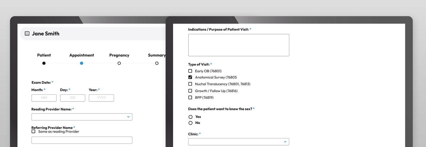
3. Information Collection - I updated the design of series of forms to help the healthcare worker easily navigate through the data collection for Patient, Appointment, Pregnancy, and Summary sections during a patient visit.
Results - The redesigned menu helped healthcare workers easily navigate through the patient data input decreasing patient exam time.
4. Video Interactions - I also was tasked with updating the way healthcare workers utilized the video screen. I researched the interfaces of both streaming video websites and video editing software to create a new way to scrub the frames quickly and interact with single frames easily.
Results - The quick search tool increased efficienty and helped telesonographers annotate quickly.

5. Intellegent Anatomy Search - A new feature the engineer and I designed was to intellegently search through the long list of anatomy to easily find and annotate on the ultrasound. The telesonographer could then view all of the annotated frames and choose the best one to include in the report to the physician.
Results - The quick search tool increased efficiency and helped telesonographers annotate quickly.
6. Operation Manuals - I designed an intuitve training card system to help healthcare workers use the software. This upright card deck sits ontop of ultrasound machines so healthcare workers can easily flip through the cards as a quick reference guide for the software and ultrasound scans.
Results - The quick reference manual increased efficienty in busy clinics. Training time was reduced and mistakes were avoided.

Goal - Increase Communication
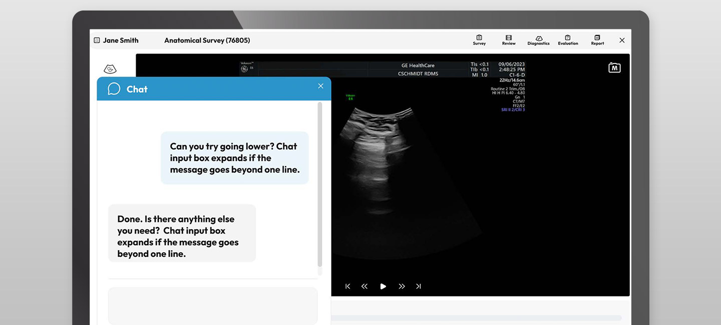
Chat Communication Tool Another important feature that was created was an in-app chat tool between the healthcare worker and the telesonographer. Healthcare workers could now easily chat with remote telesonographers which led to a streamlined workflow for conducting ultrsound appointments. The new chat allowed telesonographers to request new scans and direct the healthcare worker on exactly what they need.
Results - The communication tool saved time as telesonographers knew exactly where the healthcare workers were each step of the patient exam. Both parties could clearly communicate their needs and exam times were greatly reduced and increased patient satisfaction.
Goal - Increase Report Turnaround Speed
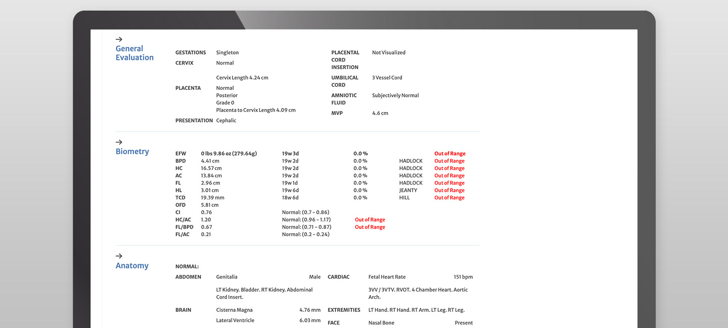
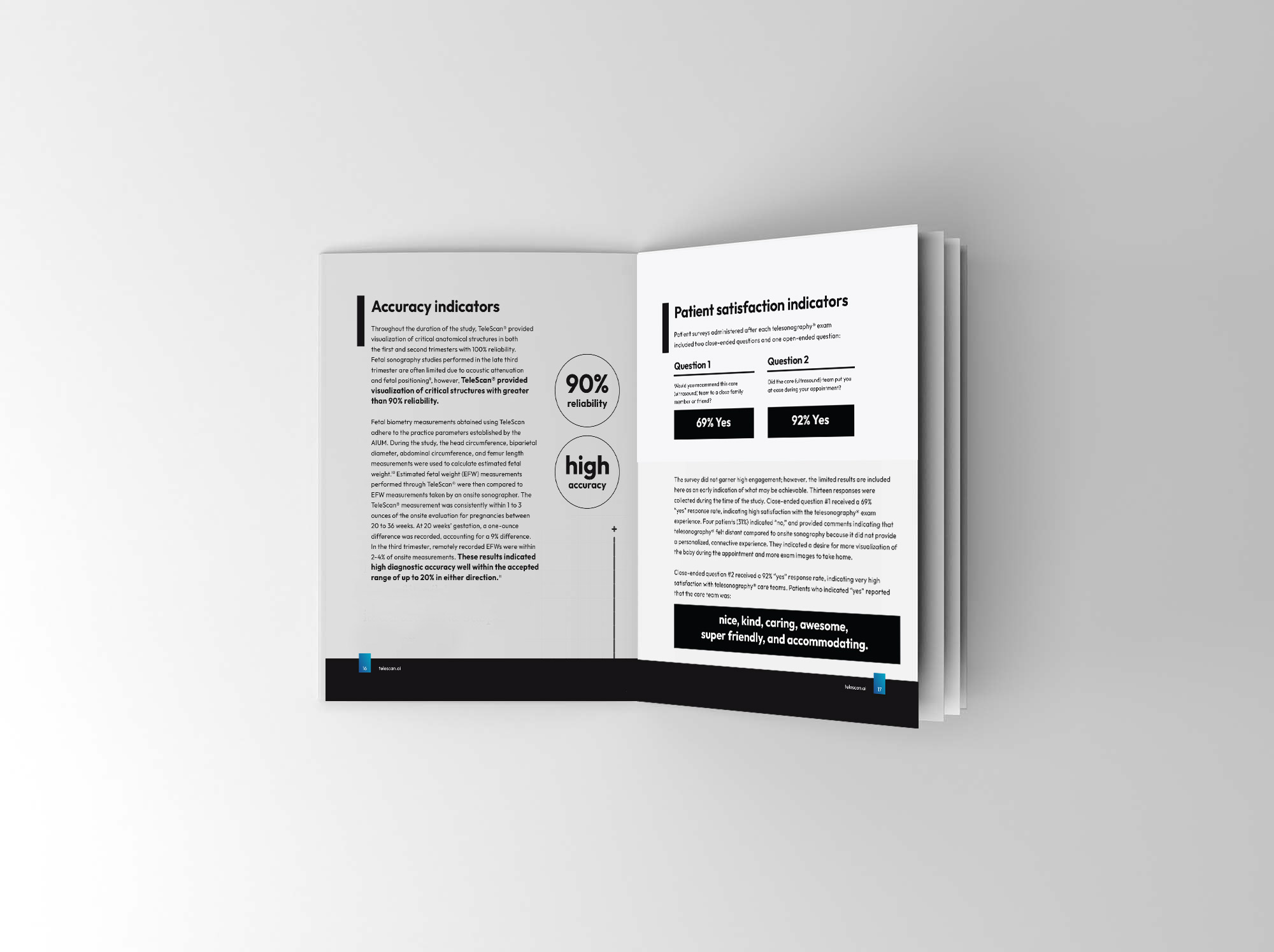
The last item I redesigns were the reports. The telesonographer sends the ultrasound diagnostic data to the physician and the physician can review, edit, and sign off on the report for the clinic. I redesigned the report to clean up all unnecessary information and reduced words on every page so the physician could easily scan the most important data and sign off quickly. Using a red color to indicate areas of abnormalities and a blue color to highlight sections, the reports were easily scanned and reduced overall time in clinics.
Results - The new reports were clear and easy to scan which enabled doctors to sign off and return to clinics at top speeds. This resulted in the clearing of longstanding backlogs! This efficiency was achieved without forfeiting diagnostic accuracy.
Research and Data
Throughout design and development, I collected quantitative and qualitative data to determine the efficiency and accuracy of the new software interface.
Qualitative Data - I interviewed and tested out the software with a range of people, including healthcare workers, telesonographers, and physicians to measure satisfaction and ease of use. Telesonographers were studied while using the software in particular, focusing on user interactions, ease of new menu systems, anatomy finding and anotating, and then interviewed about their experiences. I wanted to understand users behaviours around the new tool bar and gauge whether the new icons were intuitive and useful without verbal explanation. I found that most were, and some tool bar icons were slightly redesigned to include multiple functions at once. Keyboard shortcuts were also implemented to speed up time it took to navigate the ultrasound videos.
Quantitative Data - Exam data was gathered such as measuring appointment duration, diagnostic accuracy, and report turnaround time. Testing working builds of the app also highlighted a number of features and functionality that are pretty unique for this audience. For example, since users need to find anatomy quickly and easily, a brand new searchable library of anatomy was developed, reducing time dramatically.
VISUAL DESIGN
Goal - Brand Awareness
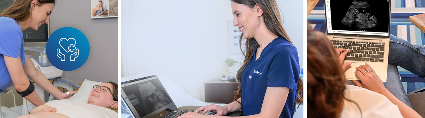
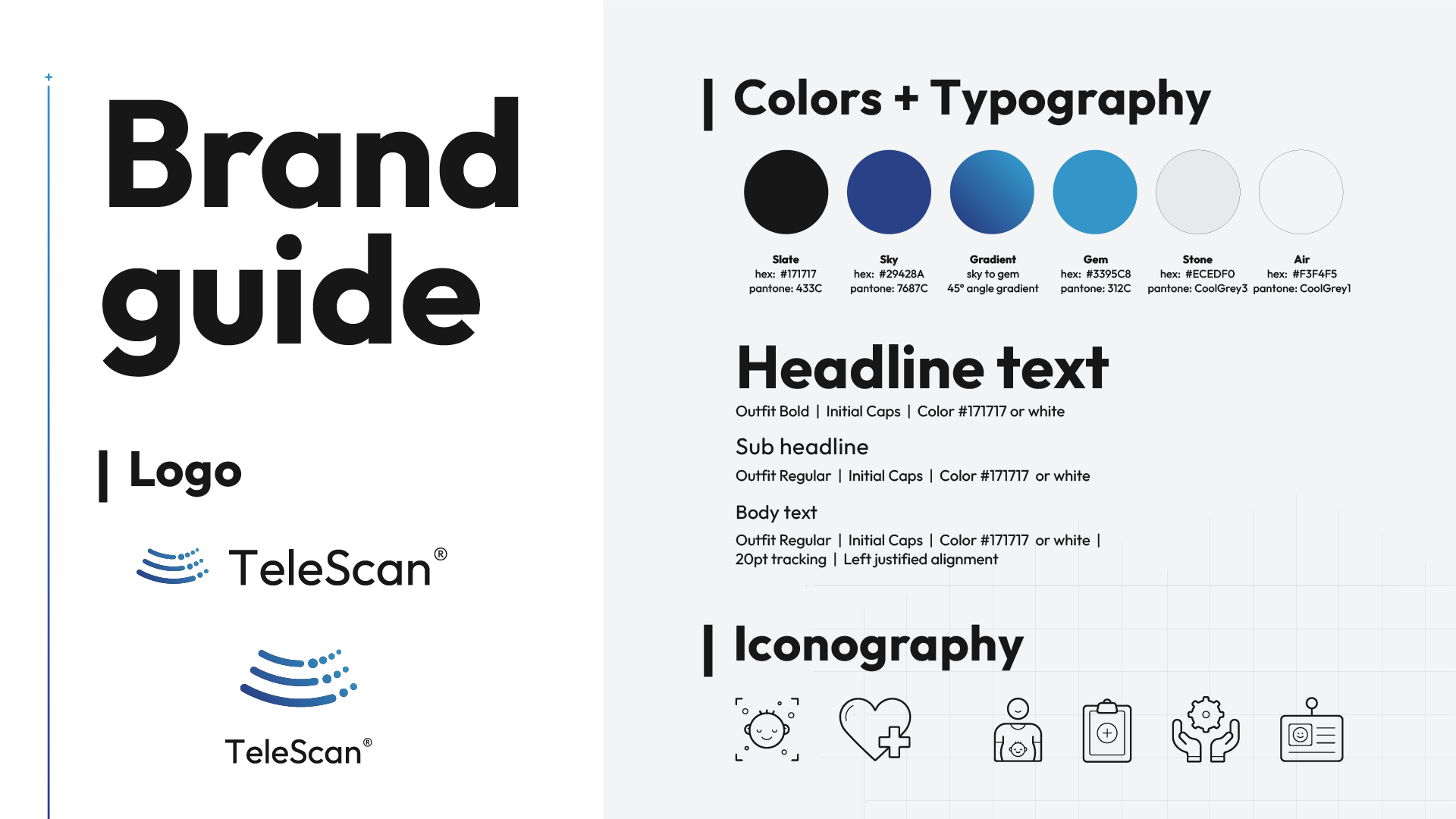
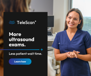
I led a rebranding exercise for the entire company. TeleScan was interested in gaining new investors, so when the new software was ready to be launched, a new look for the company was desired. I redesigned every touchpoint; their logo, color palette, fonts, print and digital marketing materials, sales sheets, investor presentations, event displays, introductory and training video series, and their social media presence. I conducted a 2-day photoshot to create a library of photo and video assets, and I built a new website!
Results - Potential clients could envision how the software product could benefit their clinics with the new photo library and the brand now told a real story. Every asset included a healthcare worker, a telesonographer, or a doctor using the software. The library was now full of storytelling pieces that highlighted the product and told real-usage experiences.
Goal - Marketing Campaign Efforts
By executing data-driven ad campaigns and optimizing marketing strategies, the launch campaigns showed remarkable results within in one year. We tracked the data with quantitative data using HotJar and Hubspot.
A 110% increase in website traffic!
Gained over 1,100 new email subscribers!
Achieved 132% social media growth (6,226 new followers)!
- Please explore the new materials below. Click thumbnails below to enlarge -
Brand Guide

Demo Video - click to view
MINI BROCHURE
White Paper

zoom branding

DRINKWARE

EVENT BOOTH DESIGN
EXECUTIVE SUMMARY

Tee shirt
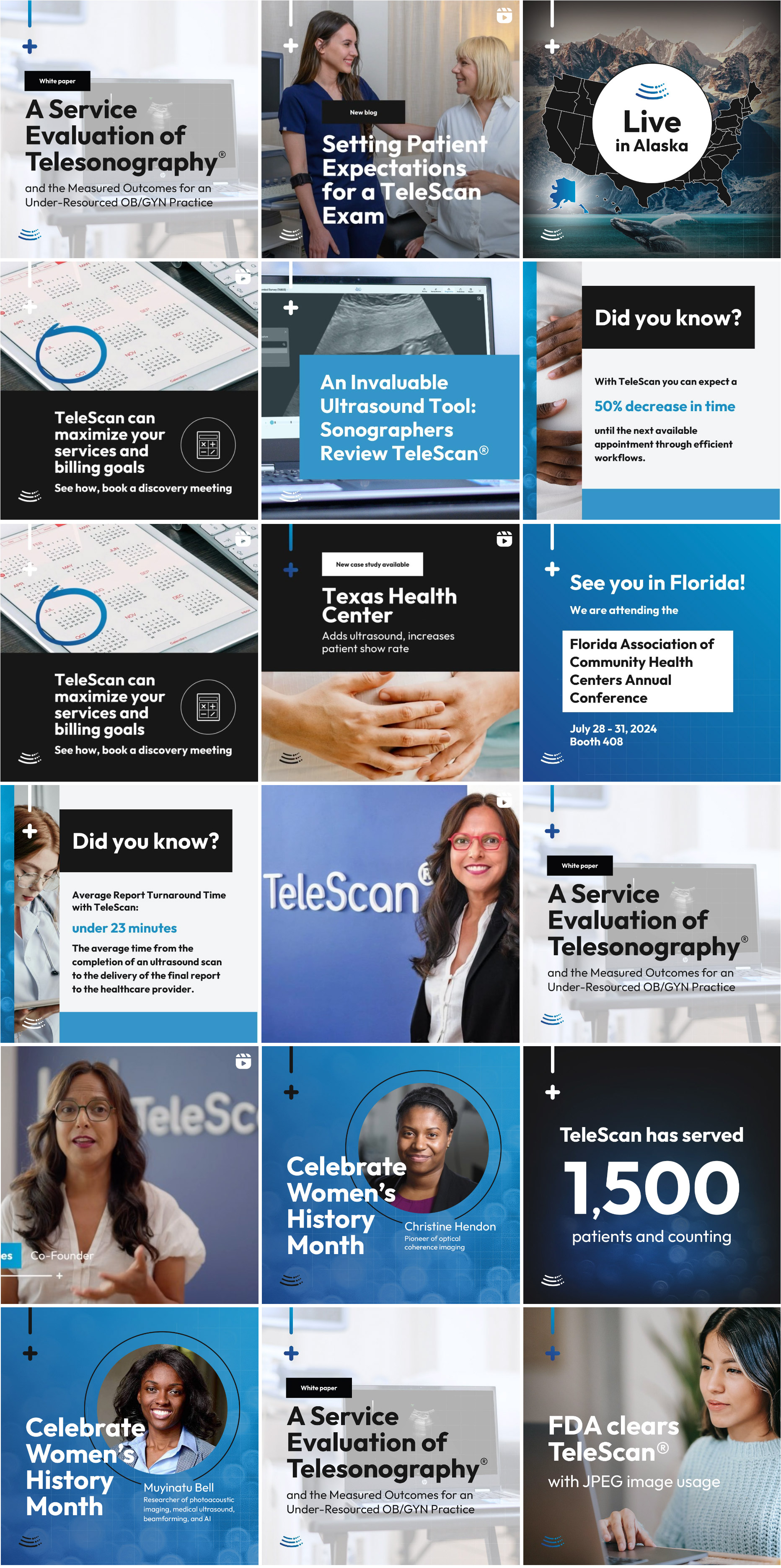
Social Media
Logo Design
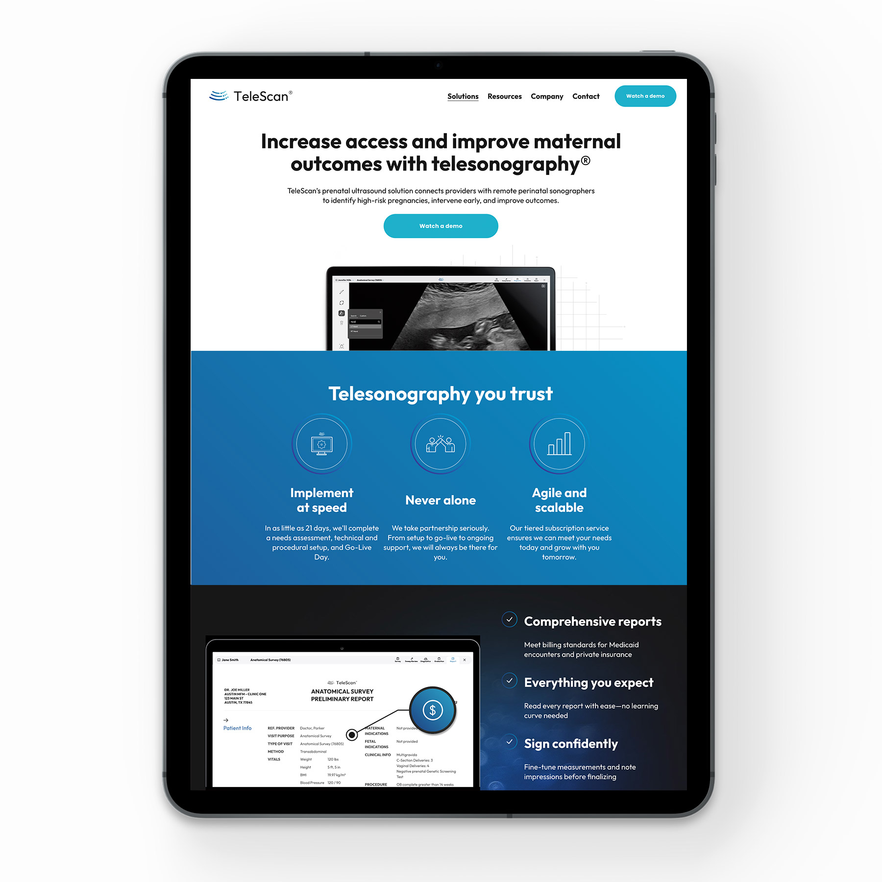
WEBSITE DESIGN - CLICK TO VISIT
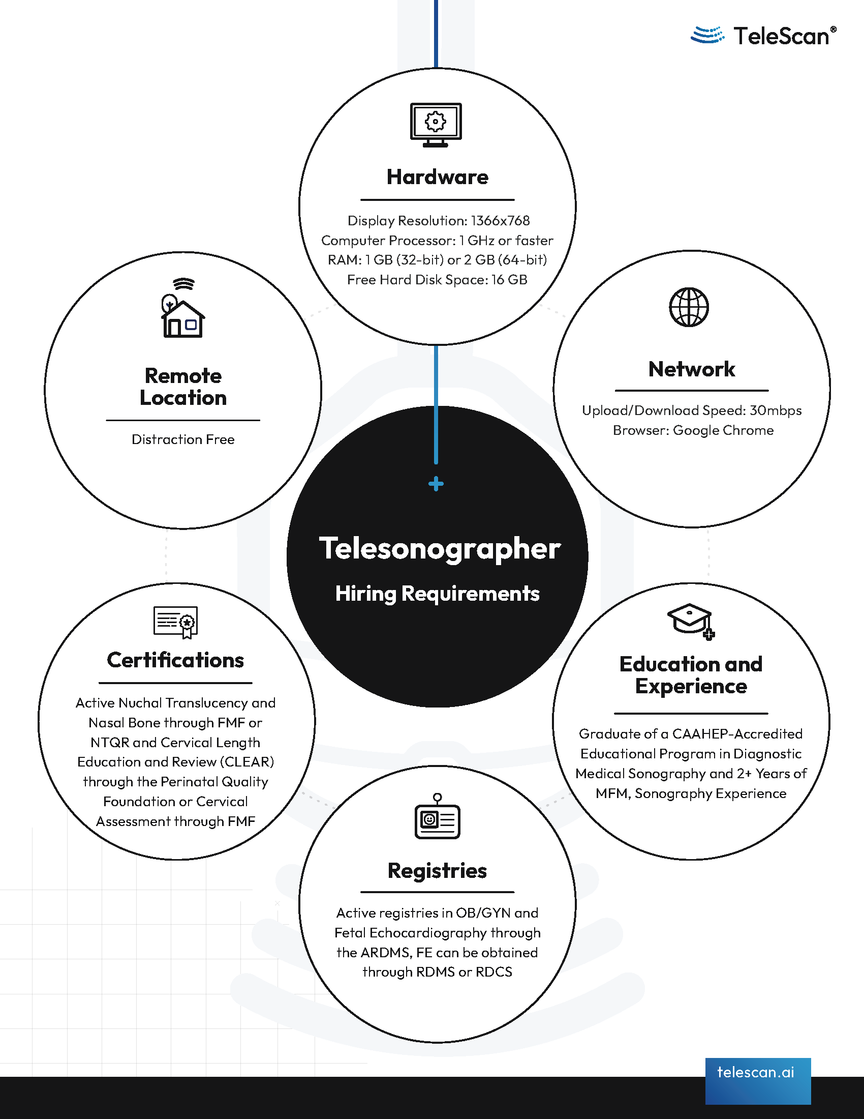
HIRING FLYER
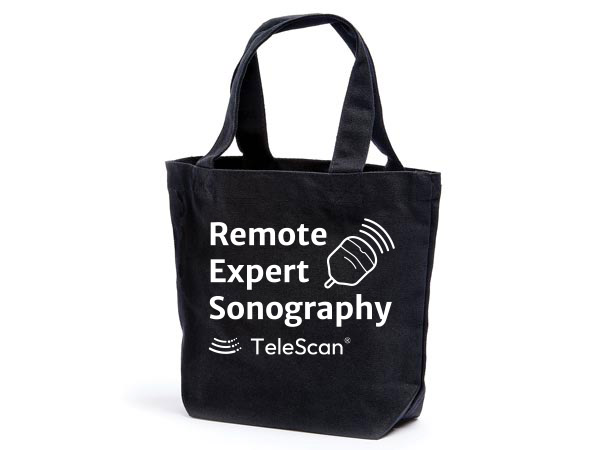
Tote bag
Presentation
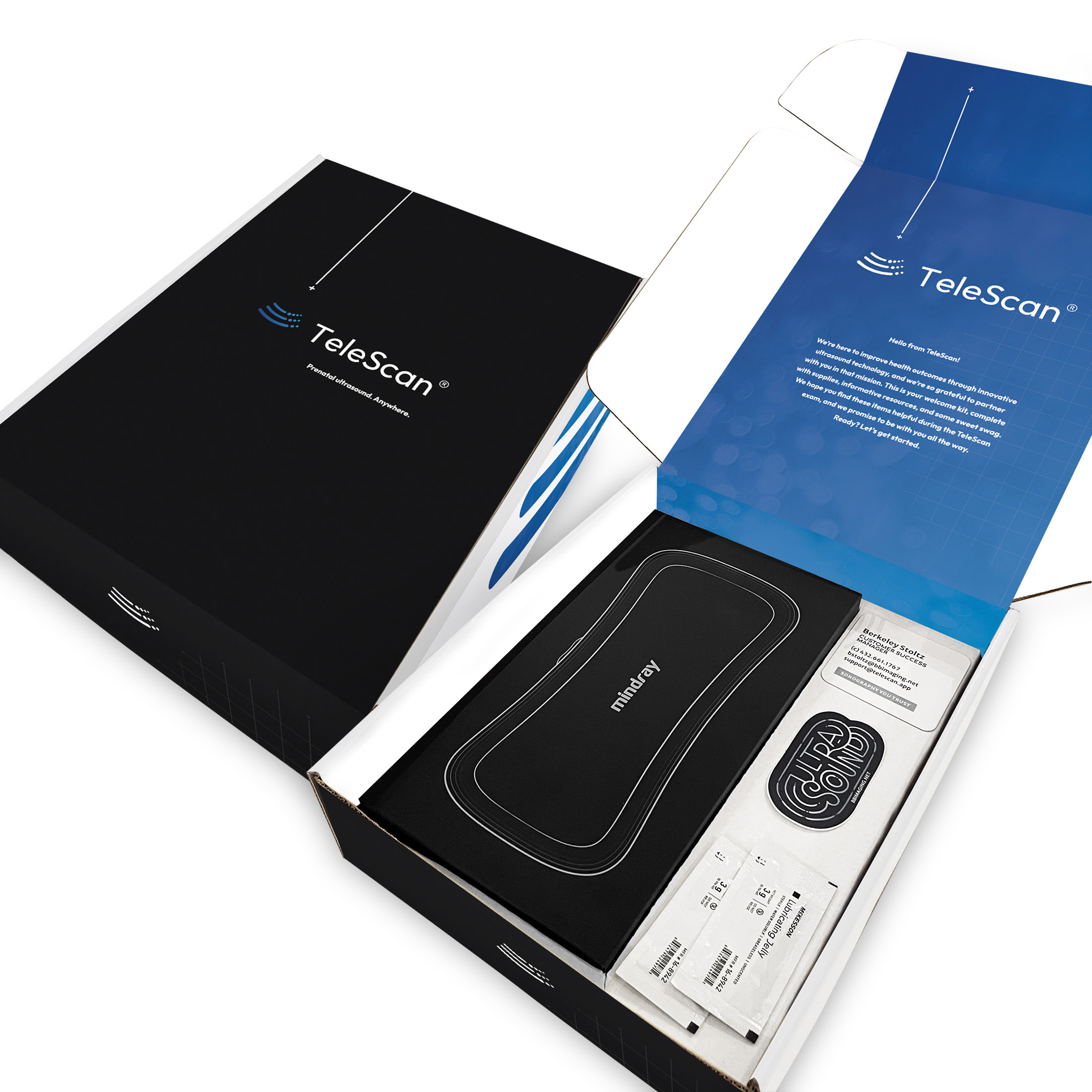
Launch Box Design
Banner Ad
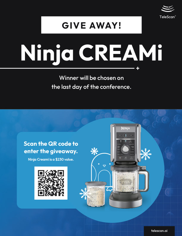
Contest Flyer